
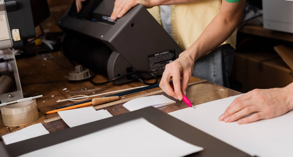
Print design might look simple, but one tiny mistake can turn your masterpiece into a marketing disaster. Whether you’re printing flyers, posters, or business cards, getting the design right is key to standing out. Let’s walk you through the most common print design mistakes and how you can avoid them like a pro.
1. Ignoring Bleed and Safe Zones
We get it — borders and margins might sound boring, but they’re the unsung heroes of great print design.
Every printed piece needs a little extra space around the edges called bleed, which helps avoid white borders after trimming. Also, don’t forget the safe zone — it keeps your important text from being cut off.
If you design edge-to-edge without a bleed or push your logo to the very corner, you’re risking disaster at the print shop. Always leave enough buffer so your beautiful design doesn’t turn into a chopping board project gone wrong.
2. Using Low-Resolution Images
We all love crisp, clean visuals — but using a blurry image in print? That’s a fast track to regret.
While screens can be forgiving with low-res images, printing is brutally honest. What looks great on Instagram might look pixelated on a brochure. Make sure your images are at least 300 DPI (dots per inch) for anything that’s going to print.
Trust us — a high-res photo of your product can make all the difference between “Wow!” and “Meh.”
3. Choosing the Wrong Fonts (or Too Many)
Fonts have personality, but sometimes, they can be a little too loud — especially when you use ten of them on the same design.
Stick to 2–3 fonts max for a professional and polished look. Pair a bold headline font with a clean, readable body font. Also, avoid script fonts for paragraphs — they might look fancy but are super hard to read in print.
When in doubt, less is more. Let your design breathe without making the reader squint or guess what you’re trying to say.
4. Forgetting About Color Mode and Paper Type
Here’s a fun fact: what you see on your screen isn’t what prints out — unless you’re working in CMYK color mode.
Many people design in RGB (which is used for screens), but printers use CMYK (cyan, magenta, yellow, black). Always convert your file before printing, or your vibrant green might print as muddy olive. Not the vibe.
Also, your paper choice matters! Glossy paper might make colors pop, while matte can give a soft, elegant feel. Think about your brand and choose accordingly.
5. Overcrowding the Design
You’ve got a lot to say, and that’s cool — but don’t stuff everything into one flyer. White space is your friend.
Trying to fit every service, every product, and every detail into a small space creates confusion. Instead, focus on your core message. What action do you want your audience to take?
A clean, focused design is much more effective than one that screams for attention from all corners.
A Quick Recap to Keep You on Track
Print design can feel overwhelming, but once you avoid these common mistakes, you’re already ahead of the game. Keep your images high quality, your fonts balanced, your layout clean, and always prep files with print in mind.
If you’re still unsure, don’t worry — that’s what professionals like Design Plus are here for! We make sure your print designs don’t just look good but also work for your brand.
Need help with your next print project? Let’s get creative together!


