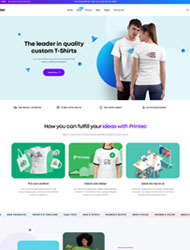
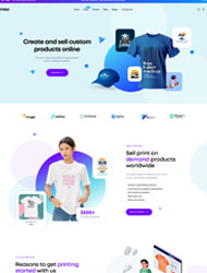
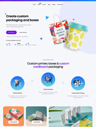
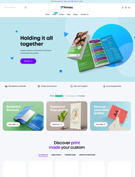
Let’s stop confusing your customers and start turning heads with brand vibes that totally match.
🎨 What Exactly Is a Unified Brand Look?
Imagine walking into a room and instantly knowing who decorated it—because the vibe, colors, and energy all scream them. That’s the power of a unified brand look. It means your logo, fonts, colors, graphics, and tone all feel like they belong together—on your website, business cards, social media, packaging, and even your email signature!
When people see your brand, they should immediately know it’s you—whether it’s a printed flyer or your Insta feed. You don’t want your Instagram to feel like a pool party while your website feels like a board meeting. Keep it cohesive and consistent.
🖌 Start with the Basics: Logo, Colors, and Fonts
Think of your brand’s logo, colors, and fonts as your visual foundation. Once you pick them, stick with them—no cheating!
- Logo: Your logo should be simple, memorable, and look good at any size. It’s basically your face online and offline.
- Colors: Choose 2–3 main brand colors and a couple of supporting shades. Use the same color palette everywhere—your social posts, packaging, print materials, and website should all wear the same outfit.
- Fonts: Pick one or two fonts that feel true to your brand personality—bold and playful, or sleek and professional? Then, don’t mix in random fonts just because they “look cute today.”
This combo should live in your brand style guide (don’t worry—it doesn’t have to be fancy). Just make it clear so that you—and anyone helping you—stay on-brand.
📦 Bring It All Together Across Every Platform
Here’s the fun part: spreading your brand vibes everywhere like glitter (the good kind).
Website: Your homepage sets the tone, so make sure it matches your other branding. Same colors, same fonts, same voice.
Social Media: Your posts should all feel like they’re part of the same conversation. Use templates for your quotes, sale posts, or announcements. And yes, throw in your brand colors!
Printed Materials: Flyers, business cards, brochures, stickers—whatever you print should look like it belongs in your brand family. It’s a missed opportunity if your digital world looks one way but your prints look totally different.
Email Marketing: From subject lines to banners, let your email campaigns give off that same branded energy. Consistency builds trust—plus it looks super professional.
Keep Your Brand Voice in Check Too
Your brand “voice” isn’t just how you write—it’s how you sound. Are you playful and funny? Or calm and informative?
Use the same voice in captions, product descriptions, emails, packaging notes, and customer replies. If your brand is the type to say “Hey bestie!” on Instagram, don’t suddenly say “Dear valued customer” in an email.
You’re not just building recognition—you’re building a relationship. Make your brand feel like someone people want to hang out with.
🌟 Wrap-Up: Make Your Brand Look Like You
The best branding doesn’t scream “professional” or “expensive.” It screams you. When every piece—from your Instagram post to your product tag—feels like a part of your story, people remember you.
So pick your brand vibe, stay consistent, and let it shine everywhere. Whether you’re printing labels, updating your site, or posting a meme, let your brand personality glow.
And hey, if you need help printing materials that actually match your brand? Design Plus has your back. 😉

